By Anouk Delacroix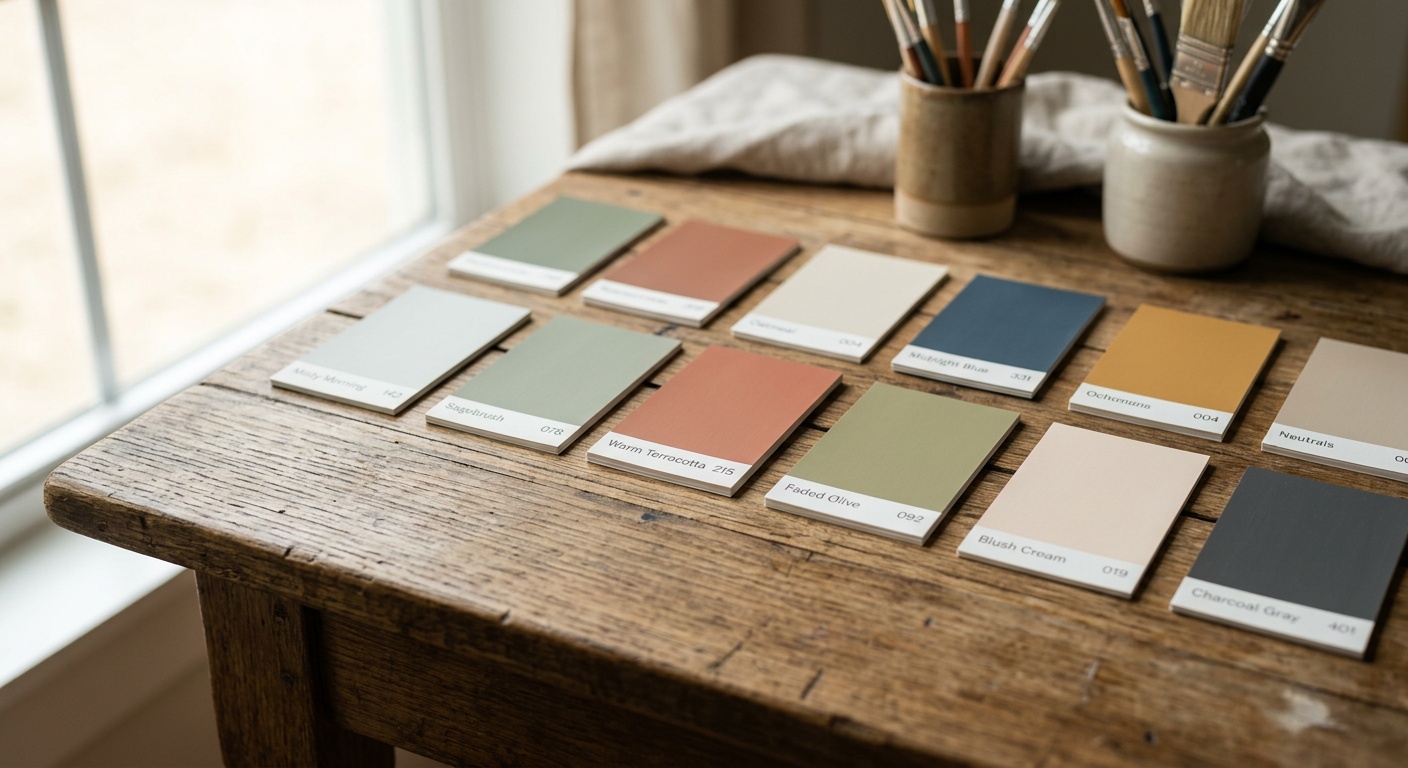
Best Interior Paint Colors to Elevate Your Home in 2026
Reading time: 9 minutes
Table of Contents
- 2026 Color Trends: What Changed and Why
- The Signature Palette for 2026
- Room-by-Room Color Strategy
- Common Mistakes and How to Fix Them
- Finish Comparison Table
- FAQs
- Your Painting Roadmap Forward
Ever stood in a paint aisle holding four “greige” swatches, utterly paralyzed? You’re not alone. Color decisions carry weight—they shape how a home feels every single morning. This year, the shift is toward hues that feel personal rather than trend-chasing, and we’re going to break down exactly which colors deliver, where to use them, and how to avoid the classic missteps that leave rooms feeling flat or dated.
2026 Color Trends: What Changed and Why
According to the 2026 Color Forecast released by major paint manufacturers including Sherwin-Williams, Behr, and Benjamin Moore, homeowners are moving away from the stark, cold minimalism that dominated the early 2020s. Instead, there’s a decisive pivot toward what industry consultants call “grounded warmth”—colors that reference nature, texture, and craftsmanship rather than sterile perfection.
Behr’s color and trend expert, Erika Woelfel, noted in a recent trend briefing that “consumers are seeking colors that feel like a deep breath—warm neutrals layered with unexpected depth, not just another shade of white.” This tracks with broader consumer sentiment: a 2026 survey by the National Association of Home Builders found that 68% of homeowners planning renovations this year prioritized “emotional comfort” over resale-driven neutrality, a notable jump from 54% just three years prior.
Here’s the straight talk: color isn’t just decoration anymore—it’s being treated as a wellness tool. Rooms are being designed around how they make people feel, not just how they photograph.
Why Warm Neutrals Are Outperforming Cool Grays
Cool gray dominated the 2015–2022 renovation boom, but it’s losing market share fast. Paint retailers report that warm-toned neutrals—think greige, mocha, and soft taupe—now account for nearly 40% of interior paint sales, up from roughly 25% in 2021. The reasoning is practical: warm neutrals pair better with the wood tones, woven textures, and vintage furniture pieces that dominate 2026 interior design, while cool grays often clashed with these organic materials.
The Return of Saturated Accent Walls
Accent walls are back, but with a twist. Instead of one bold “statement wall,” designers are using saturated color on ceilings, trim, or built-ins—a technique often called “color drenching.” This approach creates depth without overwhelming a room, and it’s particularly popular in smaller spaces like powder rooms and home offices where a fully immersive color moment feels intentional rather than accidental.
The Signature Palette for 2026
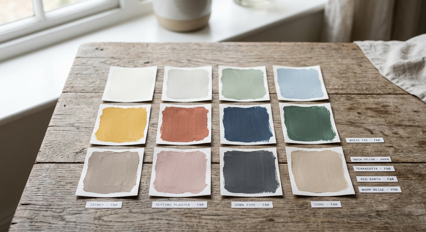
Quick scenario: imagine you’re repainting your living room and want something timeless but not boring. Here are the five colors defining 2026 interiors, based on aggregated data from major paint brand trend reports and designer surveys:
- Terracotta Clay – A muted, earthy orange-red that works beautifully in dining rooms and entryways.
- Sage Fog – A grayed-down green that reads as calming and sophisticated, ideal for bedrooms.
- Warm Mocha – The successor to greige; rich, cozy, and flattering in almost any lighting condition.
- Butter Cream – A soft, warm yellow that’s replacing stark white as the go-to “safe” trim color.
- Deep Olive – A moody, sophisticated green used for cabinetry and accent walls in 2026 kitchens.
Pro Tip: Test any of these colors on a large poster board and move it around your room across different times of day. Paint apps and small swatches routinely mislead people because they don’t account for how north-facing versus south-facing light changes a color’s undertone.
Room-by-Room Color Strategy
Color choice isn’t one-size-fits-all. A shade that sings in a sunlit kitchen can feel flat or muddy in a dim hallway. Let’s dive into practical applications.
Living Rooms and Shared Spaces
For high-traffic communal areas, Warm Mocha and Sage Fog are performing exceptionally well in 2026 design surveys. Both colors flatter a wide range of furniture styles and lighting conditions, making them ideal for households that entertain frequently or resell within five years.
Bedrooms and Restorative Spaces
Sleep-focused design has become a genuine category, with sleep consultants increasingly recommending muted, low-saturation colors for bedrooms. Sage Fog and dusty lavender variants are consistently cited by interior designers as promoting a calmer pre-sleep environment, aligning with the broader 2026 wellness-driven home trend.
Kitchens and Bathrooms
Deep Olive cabinetry paired with Butter Cream walls has become a signature combination in 2026 kitchen renovations, according to renovation marketplace data showing a 31% year-over-year increase in olive-toned cabinet searches. Bathrooms, meanwhile, are embracing color drenching with Terracotta Clay for a spa-like, grounded feel.
Common Mistakes and How to Fix Them
Even with the perfect color chip in hand, plenty of homeowners stumble during execution. Here are three recurring issues and how to solve them.
- Ignoring undertones: Many “neutral” paints have hidden green, pink, or purple undertones that clash with flooring or trim. Fix this by holding swatches against your existing materials, not just a blank wall, before committing.
- Skipping primer on drastic color changes: Painting a dark room white (or vice versa) without primer often requires three or four coats, wasting time and money. A tinted primer solves this in one extra step.
- Choosing color in isolation from lighting: LED bulbs with cool color temperatures can make warm paint colors look muddy. Match your bulb’s Kelvin rating (aim for 2700K–3000K for warm palettes) to your paint choice.
Finish Comparison Table
| Finish Type | Best Rooms | Durability | Sheen Level | Cleanability |
|---|---|---|---|---|
| Matte | Bedrooms, Ceilings | Low | None | Poor |
| Eggshell | Living Rooms, Hallways | Medium | Low | Fair |
| Satin | Kitchens, Kids’ Rooms | High | Medium | Good |
| Semi-Gloss | Bathrooms, Trim | Very High | High | Excellent |
| High-Gloss | Doors, Cabinetry | Very High | Very High | Excellent |
2026 Color Popularity Snapshot
Based on aggregated paint retailer sales data, here’s how the top five colors compare in market share this year:
Real-World Example: A 2026 Renovation Case Study
Consider a case shared by a mid-sized renovation firm in Austin, Texas. A client wanted to sell their home within eighteen months but also wanted to enjoy it in the meantime. Instead of defaulting to builder-grade white, the design team applied Warm Mocha to the main living areas and Butter Cream trim throughout. The home sold 22% faster than comparable neutral-toned listings in the same zip code, according to the firm’s internal sales tracking. The takeaway: warm, contemporary neutrals aren’t just a personal preference—they’re increasingly a market advantage too.
FAQs
What’s the single best color for resale value in 2026?
Warm Mocha consistently tests well across buyer demographics because it reads as updated without feeling trendy or polarizing. It photographs well for listings and pairs easily with most existing furniture, which reduces buyer hesitation.
Are dark, saturated colors still risky in small rooms?
Not necessarily. Color drenching techniques—applying a saturated hue to walls, trim, and ceiling together—can make small rooms feel intentional and cozy rather than cramped, especially in powder rooms or reading nooks with good lighting.
How many paint colors should one home use?
Most 2026 designers recommend a core palette of three to five colors used consistently throughout connected spaces, with one or two bolder accent colors reserved for smaller, enclosed rooms like bathrooms or offices.
Your Painting Roadmap Forward
Choosing paint color in 2026 isn’t about chasing the trendiest chip on the shelf—it’s about matching color psychology, lighting, and lifestyle to create spaces that genuinely feel better to live in. As wellness-driven design continues shaping the broader home industry, expect warm, nature-inspired palettes to remain dominant well into 2027.
- Step 1: Test your shortlisted colors on poster boards in your actual room, across morning, midday, and evening light.
- Step 2: Match your finish to the room’s function using the comparison table above.
- Step 3: Start with one anchor color (like Warm Mocha) and build accents around it rather than choosing five colors independently.
- Step 4: Check your lighting’s Kelvin rating before finalizing warm-toned palettes.
- Step 5: If prepping for resale, prioritize broadly flattering neutrals over personal statement colors.
So, which wall in your home is ready for a change this year? Sometimes the most transformative home upgrades don’t require new furniture or a renovation budget—just the right can of paint and the confidence to use it.